

Chapter Contents
Evidence for and Causes of Recent Climate Change
Page Topics: Changing Temperatures and Carbon Dioxide; Shrinking Ice Sheets and Glaciers; Changing Sea Ice Extent; Thawing Permafrost; Rising Sea Level
Image above: A portion of the famous Keeling Curve graph (see full graph below). Image from the Scripps Institution of Oceanography Keeling Curve website, which provides daily CO₂ readings.
Changing Temperatures and Carbon Dioxide
In the last 100 years both the ocean and land have warmed, and atmospheric CO2 has risen sharply. The figure below shows the global surface temperature anomaly over time from 1880 to 2020 (temperature anomaly is the difference in temperature relative to a reference time period, in this case the 20th century average).
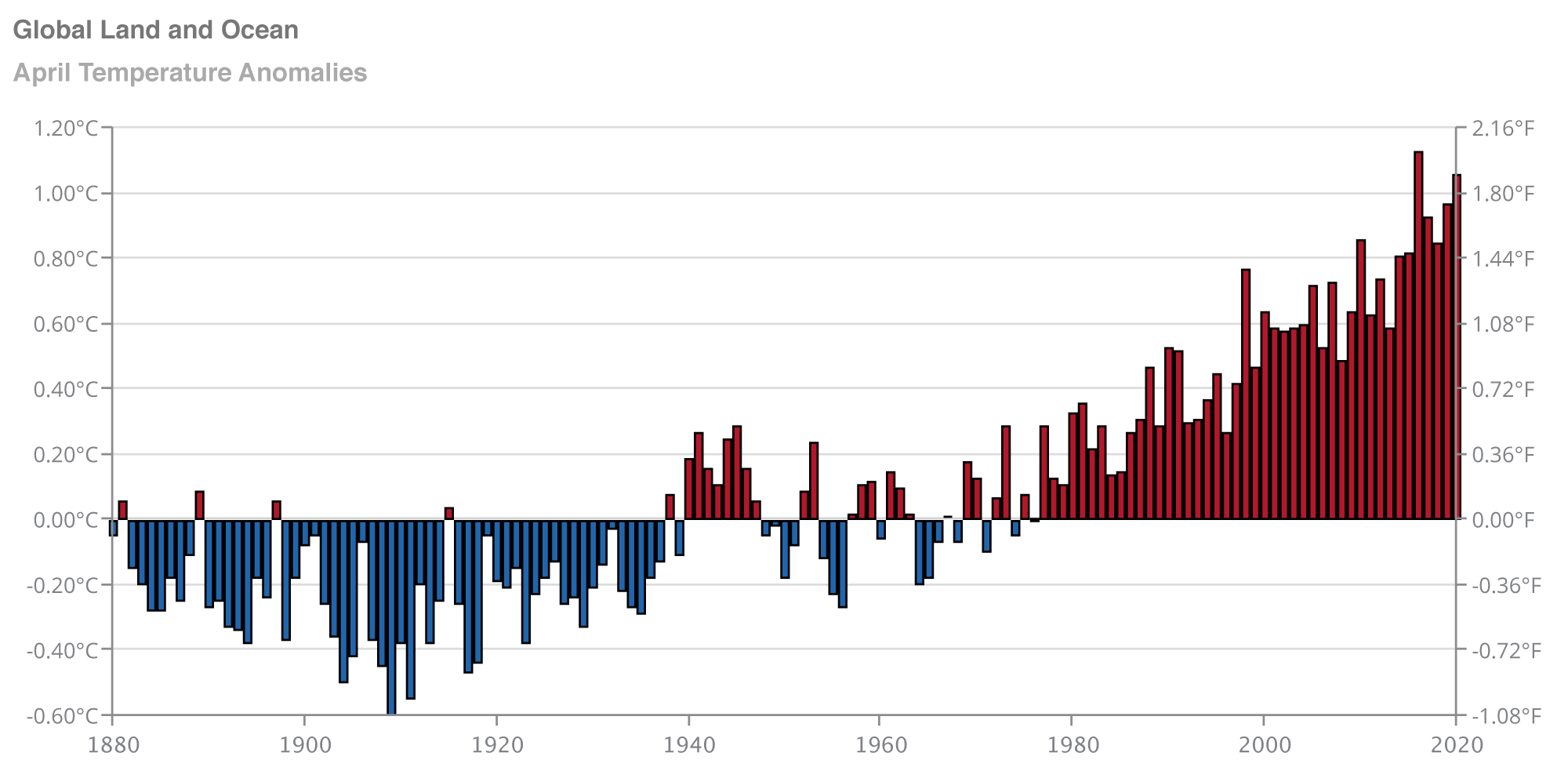
Global land-ocean surface temperature anomaly over time. Image from NOAA, Climate at a Glance (public domain).
As of the time this page was written (June 2020), the ten warmest years on record have occurred during the past 15 years (since 2005). 2016 was the warmest year on record, followed very closely by 2019. (A useful source for finding current climate summaries and reports is the National Centers for Environmental Information’s State of the Climate website.) As Earth’s temperature has increased, the ocean has been storing most of this heat energy. Scientists estimate that from 1971 to 2010, the oceans absorbed over 90% of the heat that has been added to our planet.
Global CO₂ also follows an upward trend in the recent past. The Mauna Loa, or Keeling, curve is a graph of atmospheric CO₂ measurements started by Charles David Keeling in 1958 at an observatory atop Mauna Loa, a mountain on the island of Hawai’i. Keeling’s successors continue to make these measurements today, and the graph shows a steady upward trend and an annual oscillation which results from plants in the northern hemisphere taking in more CO₂ during the spring and summer than in the winter.
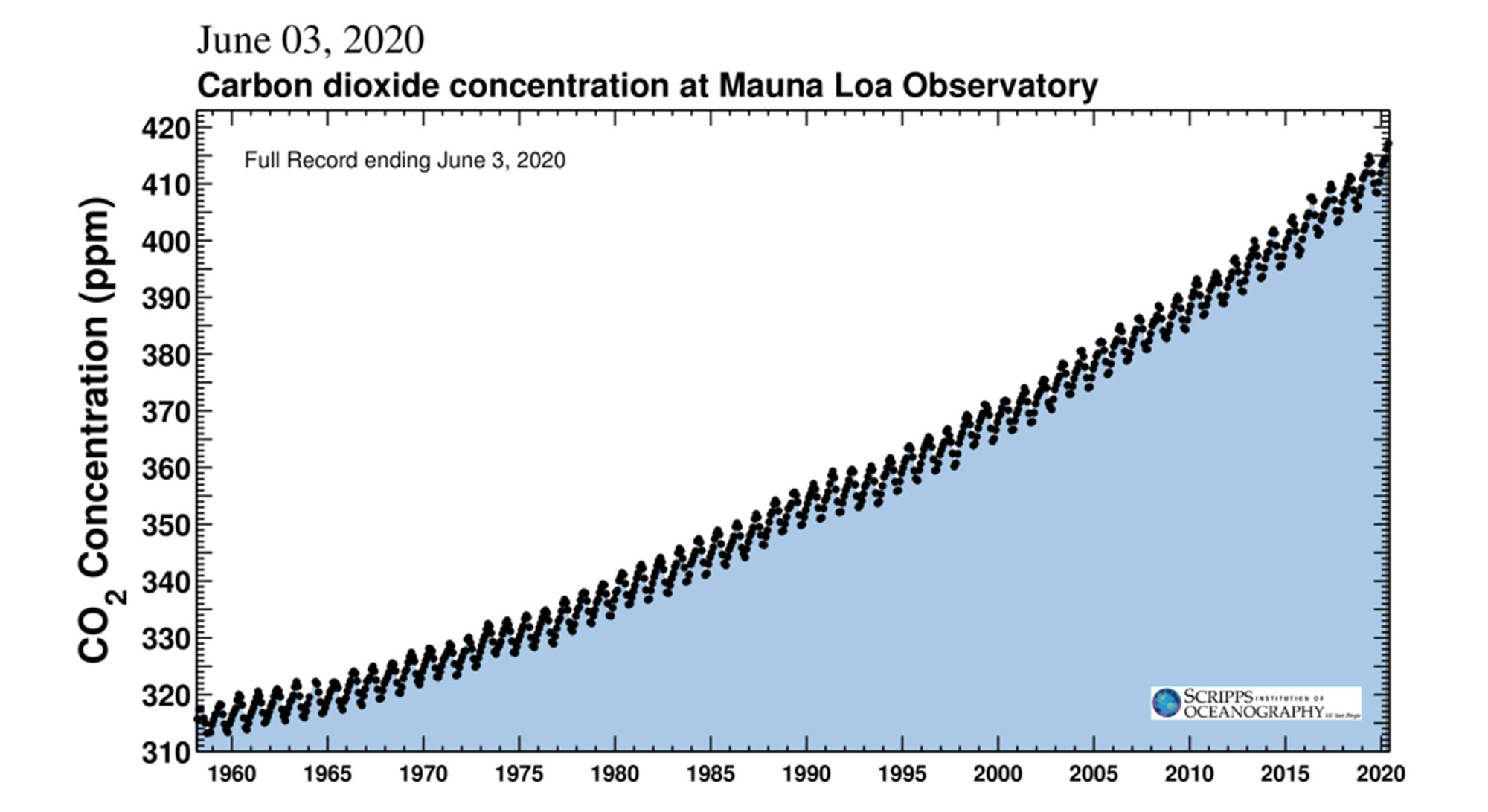
Atmospheric CO₂ concentration at Mauna Loa Observatory from 1958 to June 2020. On June 3, 2020, the CO₂ reading at the observatory was 417.19 ppm. Image from the Scripps Institution of Oceanography Keeling Curve website, which provides daily CO₂ readings.
This recent increase in atmospheric CO₂ can be compared with CO₂ concentrations farther back in Earth’s past. The figure below, which plots the Mauna Loa data together with 800,000 years worth of CO₂ data from Antarctic ice cores, shows how large the 20th century rise in CO₂ really is relative to pre-industrial levels.
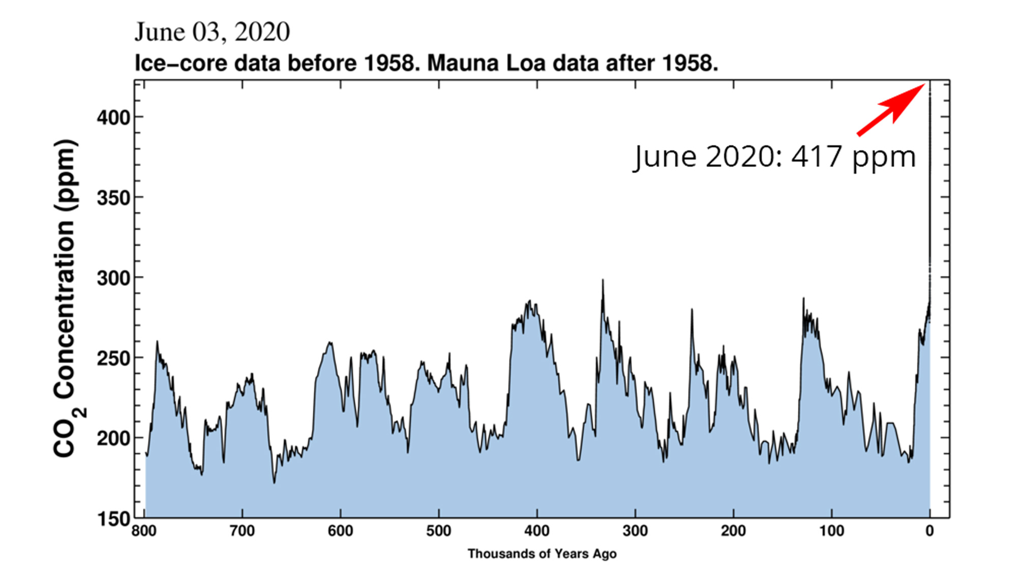
Atmospheric CO₂ measurements from Antarctic ice cores and the Mauna Loa observatory. Image from the Scripps Institution of Oceanography Keeling Curve website, with an arrow and note added to identify current CO₂ concentrations.
Scientists measure land and sea surface temperatures through remote sensing from satellites, and using thermometers on land and on ships, coasts, and ocean buoys. The satellite sensors give a much broader coverage than point measurements, and they give access to areas that are difficult to access on the surface or are dark for much of the winter. Point measurements are used to check (“ground truth”) the satellite data. The surface of the Earth emits infrared light and microwave radiation, and the intensity of that radiation depends on the surface temperature in a known way. Instruments on satellites can detect this emitted radiation, from which scientists can calculate the surface temperature.
Electromagnetic radiation can be thought of as traveling waves of energy, being emitted, absorbed, scattered, and reflected all around us. There is a spectrum—a broad range—of these waves in the universe with different frequencies and wavelengths. In our everyday experience we are most familiar with visible light because we sense it with our eyes and it contains the colors that we see. But we have everyday experience with other parts of the spectrum as well, such as radiowaves (which carry radio broadcasts), infrared radiation (which we experience as heat), ultraviolet radiation (which can give us sunburn), x-rays (in medical tests), and microwaves (in microwave cooking and police radar).
Scientists measuring characteristics of the Earth’s surface and atmosphere design sensors of electromagnetic radiation that fit the phenomena and conditions they want to observe. For example, scientists studying melting and freezing of the Greenland ice sheet have used microwave sensors on satellites because microwaves can penetrate clouds, they can be detected during the dark Arctic winter when visible light would not be useful, and they are sensitive to changes that occur on the ice sheet when the surface melts or freezes.
"How do you observe the Earth with satellites?" by FutureLearn (YouTube).
You can find temperature and precipitation data, graphs, and maps for your region from your NOAA Regional Climate Center. The lengths of the data records available to you vary by location, but you may be able to find data going back to the late 19th century.
Another source of historical climate data for the U.S. is NOAA’s Climate at a Glance website. Here you can generate maps and time-series plots of temperature, precipitation, and drought data for a broad choice of regions and time periods. Data are also available for cities, from two reliable sources: either the Global Historical Climatology Network or the US Historical Climatology Network.
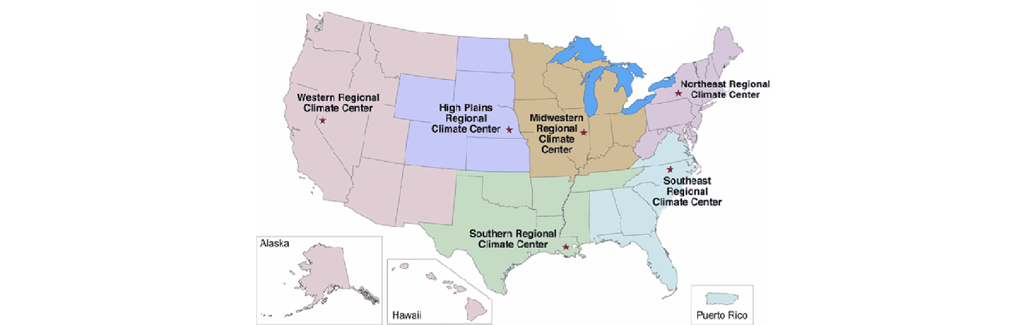
Map showing geographic coverage of NOAA's Regional Climate Centers. Image from NOAA (public domain).
Shrinking Ice Sheets and Glaciers
Although it may not feel like we are living in an ice age, when the Earth’s current climate is viewed through the perspective of geological time scales it is evident that the Earth is in an interglacial period of an ice age, with the poles containing huge masses of ice. The Greenland and Antarctic ice sheets together store over 99% of the Earth’s fresh water. The Earth’s warming is having an effect on these ice sheets, however. The figure below shows measurements of the mass of ice, in gigatonnes, lost from these two ice sheets since 2002.
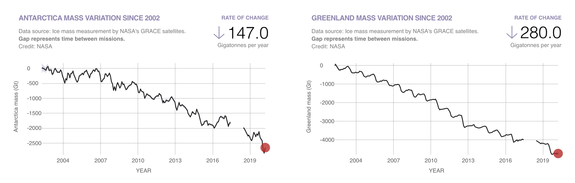
Measured mass change of the Antarctic (left) and Greenland (right) ice sheets since 2002. Graphs from NASA (public domain).
Diminished ice sheets can have a profound effect on regional and global climate. For example, freshwater added to the ocean changes ocean surface salinity and thereby currents. Large amounts of water melted from land ice also raises sea level. Less ice cover decreases albedo: highly reflective sea ice is replaced by much less reflective open water, and loss of reflective land ice exposes darker soil and rocks beneath.
Scientists can measure the change in an ice sheet’s mass in several ways: by using satellite and ground measurements to compare the amount of snow accumulating on the ice sheet to the amount of melted water flowing out, by using satellite and airborne instrument measurements to calculate the change in ice sheet elevation and volume, and by measuring changes in gravity over the ice sheet using very sensitive instruments on satellites.*
Ice sheets lose mass in several ways: melting at the surface followed by runoff of meltwater to the ocean, melting when ice on the edge is in contact with seawater, ablation, and loss of solid ice when pieces of ice break off from the edge of the ice sheet and float in the sea. This breaking at the edge is called calving, and it is how icebergs form. Additionally, very large pieces of ice sheets sometimes break off, such as in 2002 when the Larsen B Ice Shelf disintegrated in Antarctica (see images below). The portion of the ice sheet that collapsed initially was about the size of Rhode Island.
Satellite imagery documented the breakup of the Larsen B ice shelf in West Antarctica during the period of January 31 to April 13, 2002. Note the 10 km scale marker in the lower left corner of the images. Images from the NASA Earth Observatory website (public domain).
Warmer air and water temperatures accelerate these processes, which lead to mass loss. The Greenland ice sheet has been breaking records in the last few years for the earliest onset of spring melting. In Antarctica, a recent study suggested that the ice sheet is actually gaining mass in some regions to the point where total mass losses are offset, but that increasing rates of mass loss will overtake this gain in a few decades (see here).
Mountain glaciers have also been shrinking around the globe, although a few glaciers are holding steady or growing in mass. Generally, however, the trend is overwhelmingly towards glacial retreat and loss. Communities who depend on glacial meltwater for agriculture and drinking water are at risk as this trend continues. Water from melting glaciers also contributes to sea level rise, and is contributing at an accelerated pace in the last few decades. According to the latest Intergovernmental Panel on Climate Change (IPCC) report, most of the glacier mass loss around the world has taken place in the Arctic, the Southern Andes, and in Asian mountains.
The video below describes some of the ways in which the loss of ice in the Arctic negatively impacts the lives of millions of people who live in the Arctic Circle, as well as the regional and global effects of other changes taking place in the Arctic.
"What happens in the Arctic doesn't really matter, right?" by Global Weirding with Katharine Hayhoe (PBS Digital Studios; YouTube).
Changing Sea Ice Extent
The Arctic Ocean over the North Pole is covered by frozen seawater or sea ice, a feature of the Arctic that has long limited shipping and underwater exploration, and that is part of the natural environment of Arctic marine life, from plankton to polar bears. The area covered by sea ice grows in the winter when temperatures drop and seawater freezes, and shrinks in the summer as some of the new, thin ice melts during the warmest part of the year. Scientists can measure the extent of Arctic sea ice using remote sensing instruments on satellites, with records going back to the late 1970s. Measurements include total area, distribution, and thickness.
Arctic sea ice extent has decreased over the past few decades as the region has warmed, and decreased more rapidly since the turn of the 21st century. The image below shows images based on satellite data of Arctic sea ice extent, for the annual September minimum and March maximum, for 1990-1991 compared with 2018-2019. The decline in sea ice cover over 28 years is evident, especially at the end of summer.
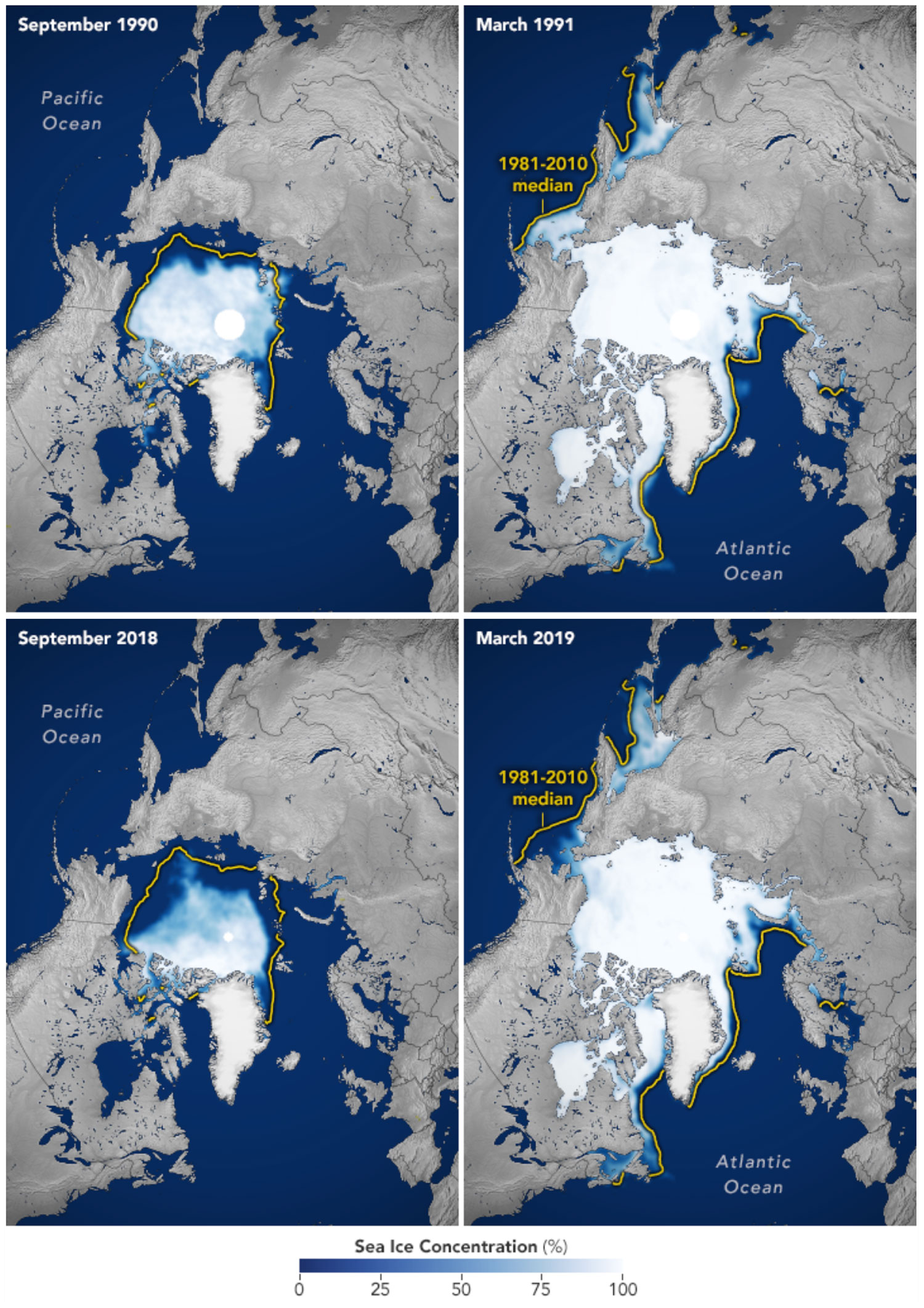
Arctic sea ice extent for the months of September (annual minimum extent) and March (annual maximum extent) for the years 1990-1991 (top pair of images) and 2018-2019 (bottom pair of images). Images from the NASA Earth Observatory website (public domain).
"Arctic Sea Ice Reaches 2019 Minimum Extent" by NASA Goddard (YouTube).
In the Southern Hemisphere, sea ice forms around Antarctica and the extent waxes and wanes in a seasonal cycle, as it does in the Arctic. But the characteristics of this seasonal cycle differ between the Arctic and the Antarctic. The Arctic ocean is mostly surrounded by land, so the sea ice that forms there is somewhat constrained from moving and grows thick over time in the coldest regions. Antarctica, on the other hand, is a continent surrounded by ocean, so the sea ice that forms in the winter is not constrained. It stays relatively thin and can move northward to warmer water. As a result, most of the sea ice that forms in the winter around Antarctica melts in the summer.
Sea ice extent around Antarctica has not declined as Arctic sea ice has, and in fact, Antarctic sea ice extent data from 1979 to 2020 show great variability from year to year but no overall trend. Scientists think that Antarctic sea ice extent is influenced more by variability in atmospheric winds and circulation of the vast Southern Ocean than by climate change.
Thawing Permafrost
About a quarter of the land surface in the Arctic is covered by permafrost: ground where a thick layer of soil is permanently frozen due to year-round cold temperatures. The Arctic is warming more rapidly than any other part of the world, and this means that permafrost is thawing. The IPCC’s latest report on global climate change concluded that it is “virtually certain” that permafrost extent in the Arctic will continue to decline, by 37% to 81% by the end of the 21st century, depending on the rate of carbon emissions from human activities.
As permafrost thaws the mechanical properties of the ground change, and structures such as roads and oil pipelines that have been built on frozen ground are at risk of damage. Another hazard from thawing permafrost is the release of CO₂ and CH₄ that have been frozen in the ground. These are powerful greenhouse gases, and CH₄ in particular can have a large, short-term warming effect. As shown in the video below, methane is also highly flammable!
"Arctic Lake Methane Ignited by Katey Walter Anthony" by UAF College of Engineering & Mines (YouTube).
Rising Sea Level
Global sea level is rising, partly as a result of a warming ocean. When water warms it expands, whether at the scale of a kettle of water on the stove or the vast volume of water that fills the world’s ocean basins.
"Thermal Expansion & Sea Level Rise (In the Greenhouse #6)" by the Paleontological Research Institution (YouTube).
Sea level is also rising as water is added to the ocean from melting glaciers and ice sheets. Melting glaciers (other than ice sheets) contributed to sea level rise at the rate of 0.76 mm per year (0.03 inches per year) from 1993 to 2009. Global average sea level has risen about 17.8 centimeters (7 inches) in the past 100 years. Since 1993, sea level has risen about 93 mm (3.7 inches) (see graph below). (Note that melting sea ice does not contribute to sea level rise because it is already displacing sea water as it floats.)
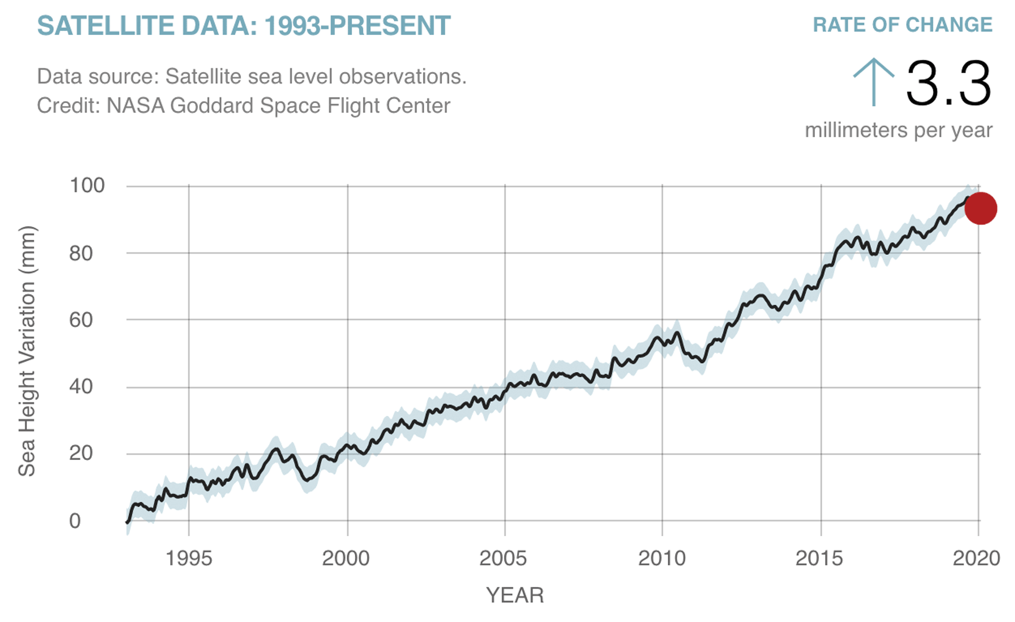
Global average sea level change as a function of time, with a base year of 1993. Image is from NASA's Global Climate Change website (public domain).
Sea level rise is close to, but not exactly, uniform everywhere. Ocean currents can pull water toward or away from coasts, effectively raising or lowering sea level. In some places the land is sinking (subsiding) or rising (being uplifted) because of geologic forces. In many places land uplift and subsidence occurs due to tectonic changes, which may occur over many millions of years. In high latitudes where glaciers covered the landscape, the ice sheet depressed the continental crust downward into the mantle; since melting back the land has been “rebounding” upward. This is happening wherever ice sheets covered the land, for example, across the northern part of North America. Land subsidence may occur over extended periods due to deposition of sediment from rivers, and over shorter time scales due to human activities such as groundwater and petroleum extraction. Where land is subsiding, such as along the US’s East and Gulf coasts, the relative rate of sea level rise is higher than the global average. Where land is rebounding, sea level can be decreasing. The image below shows a map of sea level trends along coasts worldwide. The highest sea level rise rates in North America are along the coast of Louisiana, where rates are in the range of 9–12 millimeters per year (3–4 feet per century).
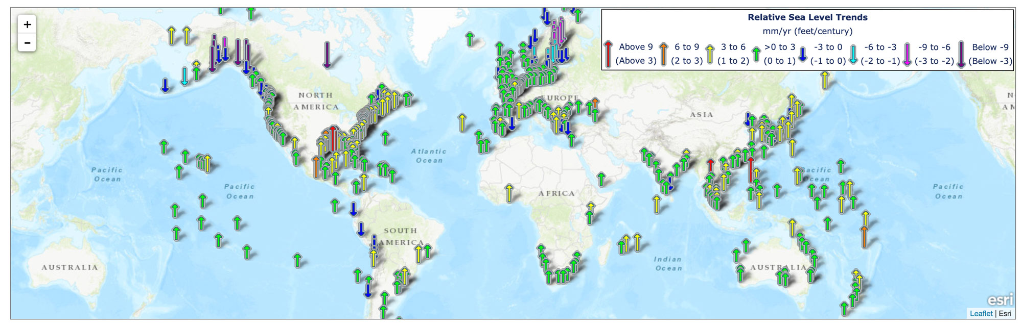
Regional sea level trends worldwide. The arrows represent the direction and magnitude of the change. Map from the NOAA Tides & Currents website (public domain).
Scientists measure sea level in two main ways: with tide gauges along the coasts, and with altimeters on satellites. Modern tide gauges use a radar fixed on a structure such as a pier or bridge, pointing down at the water to measure the distance from the surface of the sea to a fixed point. A detector measures the round-trip travel time t of the radar (microwave) beam between the instrument and the sea surface, and then distance is calculated in the following way:
d = ct/2
where t = round trip travel time and c = speed of light (i.e., the speed of the electromagnetic wave transmitted by the radar). Changing sea surface levels from waves and tides are averaged over time. GPS readings can be used to correct for any upward or downward motion of the land.
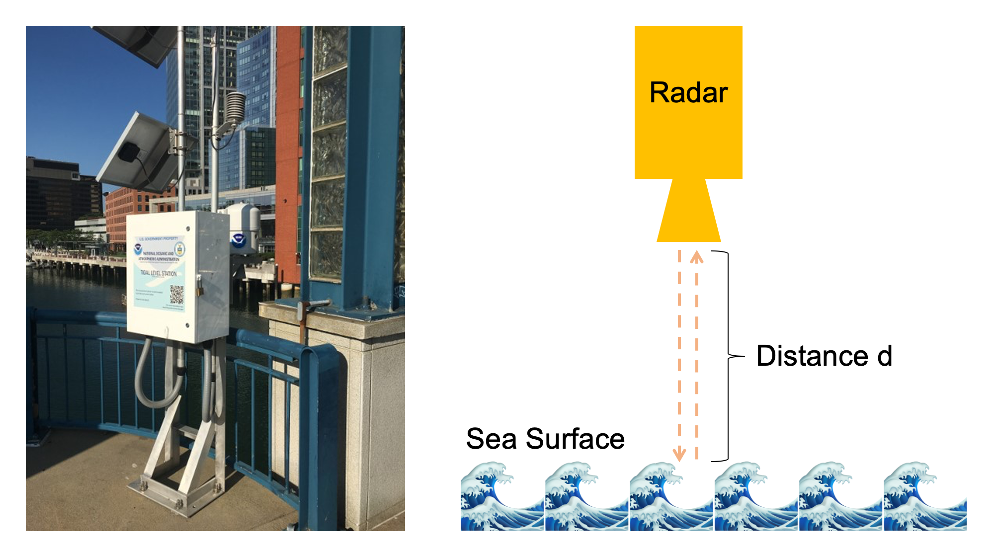
Left: Photograph of a tide guide station in Boston, Massachusetts; photography by Ingrid Zabel. Right: Schematic of a radar-based tide gauge. Image created by Jonathan R. Hendricks for PRI's Earth@Home project (CC BY-NC-SA 4.0 license).
Since 1992, scientists have been able to measure sea level very accurately using data from altimeters on satellites. Altimeters work according to very similar principles to the radar tide gauge described above. Because they are on satellites they can gather data over large areas and in the middle of the ocean instead of just along the coast.